But as weeks passed, the cards became easier and I began to itch to try my hand at making something bigger. So I began to ponder what to do. I didn't want to put a call out that I was ready to make a scroll, because what if I wasn't very good at it or gave up half way? While my child was asking me, once again, to play Bene Bache Venies, I got an idea. The Bene Bache is from the Carmina Burana manuscript which was filed with songs of love, drinking, lust, etc. So, why not try and recreate a open page of the Bene Bache?
So I began to research to see if I could find the actual manuscript of the Bene Bache. I could not. So I began to see if there were any other full page illuminations I could find (there are only 8 in all of the Carmina Burana), but other than the inspiration for one of my cards, I couldn't find another full page. So, although I am certain that it was in reference of a different song of spring and lust (I mean, look at all the symbolism in that picture!), I used it as the opposite side of the song.
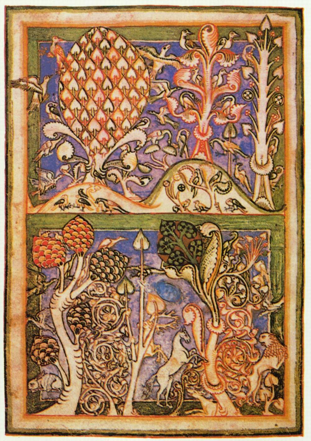
I then found, what I believed, were all the words of the song. I sketched out the lines of where the words would be placed and found this amazing illumination that I was going to place as a break between verses of the song to make it pretty. Probably after the chorus.

Then I sat listening to the song as my son bounced around the room for the fifteenth time that day. And I was singing along with the latin in front of me until... wait... where is that verse? And that one!? So I put a call out for anyone who knew where I could find all the verses. Finally they were acquired, thirteen in total. Not the eight I previously thought there was along with a pretty illumination. Well, scratch the illumination.
So I finally got everything set up and decided to ink out the base colors for the illumination, all painted on with a paintbrush, so that it had plenty of time to dry while I worked on the words.

At this point I needed to start figuring out what style of typography was correct. I found something I thought was close and decided to work with it. Once I got the first line down, I couldn't change it anyway. And I am someone that works a lot better if I just have all the uppercase and lowercase for different typographies written down just like that so I don't have to try and pick them out from the words. In fact, that is a project I may work on at some point, out of ease. Unless someone knows of someone who had created a book of just lettering from the various manuscripts for easy reading/access. If you have seen something like that, please point it towards me.
So, I began the words. The illumination used to black for the drawn design. The illumination is more toned down than that, so I used a sepia instead. The words, though, I wanted to stand out bold, so I did them in black.
I started with a c-4 nib, thinking it would be okay. You can see the first line of the song is actually a little thicker than the next written line. And this is my first time writing for a long time instead of just three words, so keeping things even and similar was difficult. I think I need to practice more on that to get good at it. I'm feeling good with the illumination and now want to work on my calligraphy. In either case, when I switched over to a size c-5 nib, I felt a lot more comfortable, but I think I would like to pick up a few c-6 and play with them and see what they do. I have a feeling the font will be even more elegant that way.

Close up, it doesn't look the most amazing, but further away? Wow. It popped.

I decided, like in some manuscripts I had seen, I would make the chorus a separate color that was not too obtrusive. I used blue, since it is also pretty heavy in the illumination. Other than the base lines, nothing was done with a nib in illumination. It was all done with paint brush mixing various brands of inks.

You will notice a difference between my illumination and the one of the original. It must have been wider, because I was having trouble making sure everything fit, so the lower pane left out some of the curly vines to the right of the first tree on the left.
In either case, it seemed to come out well.

Final size: 14" x 17"
Based on: the Carmina Burana, circa 1230-1240.
Materials: bristol paper and inks applies with nibs and paintbrush.
No comments:
Post a Comment